Thursday, 13 October 2011

Week 10 - Musee du quai Branly

Today's lecture focused on the Musee du quai Branly which is a famous museum in Paris that has an exhibit on Indigenous artwork. The article by Brenda Croft and Hetti Perkins said that "it embraces the strength of tradition and the spirit of modernity". This is a great description of the cross-cultural collaboration that is involved. I was really impressed with the unique design of the building and the way in which the artwork was displayed. Giant large scale versions of artists work were recreated on smaller pieces that could be tiled together to cover the entire ceiling of each floor. I think this idea was really effective as it allows viewers to get fully immersed in the artwork. It was really cleaver how the small tiles were designed to be easily transportable and fit together perfectly. I really like how the polished surface creates a reflection and adds to the intriguing modern external view of the building. I think the authors in the article sum the connection up well when they say it "generates a synergy between the work of the artists and the architect".

Different views of the exterior. Some of the artwork can be seen from the street below.

The reflective surface works with surrounding features.

Monday, 3 October 2011

Gloria Petyarre Paintings

I have been looking on Aboriginal Art News lately and the striking artwork by Gloria Petyarre grabbed my attention. Her paintings seem to have a really alluring quality to them as well as a distinctive style that doesn't involve the traditional dot methods. Her techniques of layering and producing fine detail, creates visual depth and movement. I particularly liked the series on bush medicine dreaming. It depicts particular leaves from plant species, which contain medicinal properties and tells of their celebration in ceremonies.

'Bush Medicine Leaves' by Gloria Petyarre
 The use of bold colour creates visual intensity.

 'Bush Medicine Dreaming' by Gloria Petyarre
This work creates a strong sense of movement.

'Mountain Devil Lizard Dreaming' by Gloria Petyarre
The many complex layers in this work make repetition interesting and give depth.

Friday, 23 September 2011

Balarinji Designs Studio / The Jumbana Group

I am studying graphic design and was wanting to find something that related to my area of study. I was recently told about an Australian Indigenous Strategy and Design Company based in Sydney named Balarinji Designs Studio that is part of the Jumbana Group. It produces designs for a wide range of mediums and has been involved in commissioning and creating designs for Qantas jumbo jets and other commercial material. They were established in 1983 by John Moriarty and Ros Moriarty,  and it says on their website that they deliver 'groundbreaking commercial and non-profit outcomes in relation to Aboriginal Australia'.


The jet design was inspired by the dramatic colors of sunset at Uluru and represents one of the many dreamtime stories. I like the bold use of colour and strong line work; as well as how the design blends ancient patterns and symbols with modern technology. It is interesting that both Aboriginal and non-Aboriginal artists transferred the design from computer to the airplane's exterior.


The studio was also commissioned by The International Cricket Council (ICC) to create the ICC Cricket World Cup 2015 logo (shown above). The design combines both Australian and New Zealand cultural motifs so as to reflect the two indigenous countries' cultural identities. I think this is an attractive and dynamic logo which captures the cultural influences of the two countries in a harmonious way and also has a feeling of celebration with the bright colours used.

Thursday, 15 September 2011

Opal Field Gems Mine and Museum

In my travels I spotted a sign outside a city opal store featuring an Aboriginal art gallery. There were a wide range of original paintings, artefacts and lots of didgeridoos all belonging to the Aboriginals of South Australia. As I wondered around, I could hear the kind of haunting sound of the didgeridoo playing in the background. It was interesting to learn that traditionally only men played that instrument. I was impressed by the variety of the intricate designs and bold colours that embellished each didgeridoo. Each was a unique uneven shape and created a natural yet dynamic arrangement as you can see in the photo below.

Some of the didgeridoos on display in the gallery.

Thursday, 8 September 2011

Spirit in the Land Exhibition

This is a free exhibition showing at the Flinders University City Gallery at the State Library. It focuses on Australia’s unique relationship with the land and notions of an Australian identity. Eleven different Australian artists exhibited select works, with historical, contemporary, indigenous and non-indigenous significance. It features some of Australia’s most prominent artists, such as Lorraine Connelly-Northey, John Davis, Russell Drysdale, Rosalie Gascoigne, Emily Kame Kngwarreye, Dorothy Napangardi, Sidney Nolan, John Olsen, Lin Onus, Rover Thomas and Fred Williams. Below, I have discussed a couple of artists that really stood out to me.

Lin Onus
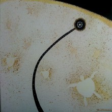
Lin Onus’ painting ‘Ginger and my third wife approached the roundabout’ was a really interesting and intriguing piece of artwork. I thought the title was really strange, yet related to the painting well. The work combined Aboriginal Rrark patterning with a more contemporary western-realist style. The overall effect resulted in a somewhat abstract feel, yet all of the elements seemed to fit well together. The background appeared realistic and the shadows under the rays help create depth.

‘Ginger and my third wife approached the roundabout’ Lin Onus


Rosalie Gascoigne
The artworks by Gascoigne grabbed my attention quickly as I found they were different and quite unique. The installation displayed on the floor called ‘Inland Sea’ was made up of a number of corrugated iron pieces she had collected. They were cut into squares and raised up by circular wire stands to create a kind of loose grid arrangement. The pale greys and whites of some of the sheets imply clouds, while the green and red sheets suggest the landscapes hilly plains. By lifting the pieces up at differing heights they reflect the rise and fall of the landscape and the wind rippling the water like gentle waves.

Rosalie Gascoigne ‘Inland sea’
Weathered painted corrugated iron, wire


Emily Kame Kngwarreye

I was immediately attracted to Emily’s work as her paintings use rich vibrant colours that grab your attention. She worked in many different styles but her energetic gestures always reflected an aspect of her Dreamings and home country. The bold and expressive lines (yam tracks) that interconnect and overlay in her piece Kame Colour II reflect the endless landscape of Australia. When I stood infront of this large painting, I got a feeling of great complexity and the warm colours used reminded me of the hot climate in central Australia.

Emily Kame Kngwarreye - Kame Colour II

Tuesday, 6 September 2011

'Eleven' by Christopher Crebbin Exhibition

This was another exhibition at Tandanya that I saw. Christopher Crebbin is a local artist and painter also known by his Aboriginal name, Burthumarr meaning Brolga. This is his 11th exhibition in his 11th year as a professional artist and held in 2011, so I think 'Eleven' is a very fitting name.

 
Full Moon, 2011
acrylic on canvas

 Ochre Turtles, 2010
acrylic, ochre, mica

Yellow Serpent, 2010
acrylic on canvas

Serpent Rising, 2009
(This one wasn't actually in the exhibition but I thought it illustrated the beautiful detail and bold colour he often uses) 

The first paintings I saw as I walked in this exhibition were a series focused on serpents. These couple of paintings set the atmosphere with their vibrancy and bold colour. The artist seemed to set a mood through his paintings and they all share a common theme of the natural Australian environment. I noticed that he used acrylic paint in all of the displayed works, but he also used other materials such as ochre, mica and metal base on others. I think by using these materials he adds earthly textures to his paintings. I also like the clean, clear colour in each artwork and the attention to detail.

There were four paintings in the collection called the ‘Tree Protest Series’ that reflected the beauty of Australian wildlife, as well as the destruction caused by bushfires. They were also about trees being chopped down and animals losing their homes, followed by regrowth. Trees are, in fact, a focus throughout the exhibition as a way of resembling life and healing. The ocean is also strongly represented throughout his works, and the vibrancy of the blues which he uses to depict the water is very striking. I really enjoyed this whole exhibition.

Monday, 5 September 2011

Symbols

After attending Tandanya and looking at those artworks up close, I was able to appreciate the fine detail and textures used in the artists work. I found that a lot of the paintings used symbols and marks that had different meanings behind them. Upon further research, I found this chart that clearly and very simply explains the definition of some of the symbols.